MANfanwas probably going for the chrome look, in the way the MM2 is capable to show chromeJon wrote: Could you do something with the two big round buttons?
Texture them brown + black or something to give them a more suitable look.
Classic Madness Radio: Done
Moderators: Frost, Luigi, HQTM-Team
-
James Beckerson
- HQTM-Team
- Posts: 295
- Joined: 2004-07-18, 21:19
- Location: Poznañ
- Contact:

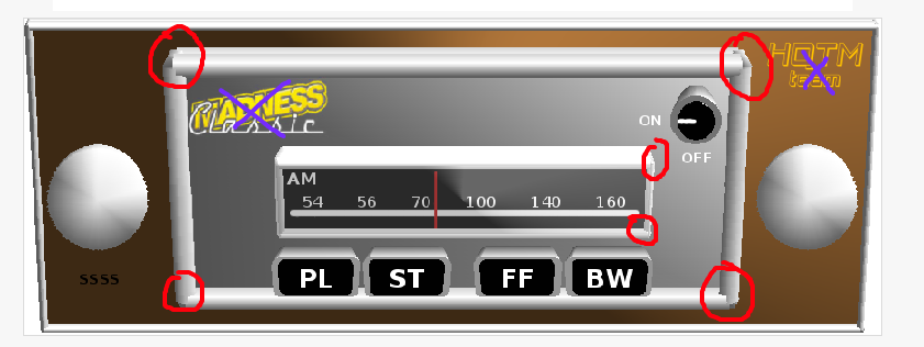
The idea is ok, but ...
I'm not sure what you mean by preview, are you going to do it once again without 3d? If yes, then skip next sentence. If not, then ...
... quality isn't good enough yet. Things I don't like in the 3d preview are:
- there is no no shadow and because of that it looks strange
- corners have some mess
- buttons - I don't know how to explain it, look weird
Let's talk about idea which is good, I like it but I don't think that having Classic Madness or/and HQTM logo is good idea, in my opinion it should be replaced by logo of vendor or with something similar. And I hope that final version of the skin (I'm still looking forward to see it) will be made in the style of CM's dashboards
Check this images
... You only have to know how to prepare query, google will do the rest ...
... My software ...
... Guide to Punctuation ...
... My software ...
... Guide to Punctuation ...
The corners etc are because of the way it has been modeled, not connected properly.
Maybe just experiment with photoshop or fireworks to create some detailed knobs for the tuning etc.
So it will suit every dash maybe do a more neutral colour, not brown, as that will not go well with red dashes etc...
Maybe just experiment with photoshop or fireworks to create some detailed knobs for the tuning etc.
So it will suit every dash maybe do a more neutral colour, not brown, as that will not go well with red dashes etc...

Please show it without perspective (just flat view), because in the game, it will be flat, so I don't see any sense in show that kind of view.
... You only have to know how to prepare query, google will do the rest ...
... My software ...
... Guide to Punctuation ...
... My software ...
... Guide to Punctuation ...


-
Pierre Films

- HQTM-Team
- Posts: 26
- Joined: 2004-10-30, 05:47
- Location: Dallas, TX
I personally don't care for the 'wood' background. Most vintage car stereos were black and chrome. Even in cars that had wooden dashboards. I think the best option would be to do what HQTM does with their dashboards which is to edit a front-facing photo of a real vintage car stereo. Looks a lot less cheesy than a 3D made one.
Pierre Films
Pierre Films